

Red has never been a colour for the timid, but that is precisely its appeal. Used well, it can create extremely stylish and energetic spaces. The secret is not to treat red as a dare, but as a design tool.
There is clear appetite for the shade. Pinterest’s 2025 trend report recorded a 235% rise in searches for dark cherry red, signalling a move toward richer, more expressive colour choices rather than safe all-neutral schemes. That does not mean every wall needs to be scarlet. It means red is back in the conversation, with far more range than its reputation suggests.
Start with the mood, not the color code
Before choosing a hue, decide what you want the room to feel like. Tomato red is sociable and playful. Oxblood and burgundy are intimate, enveloping, and a little glamorous. Brick and terracotta carry more earthiness, while a clean lacquer red delivers graphic confidence.
This is why a red interior can suit almost any decorating language. A soft, brown-based red has real affinity with linen, antique wood, and handmade ceramics. A cooler crimson looks striking against chrome, marble and high-gloss lacquer. The colour may be bold, but its personality depends entirely on its undertone and the company it keeps.
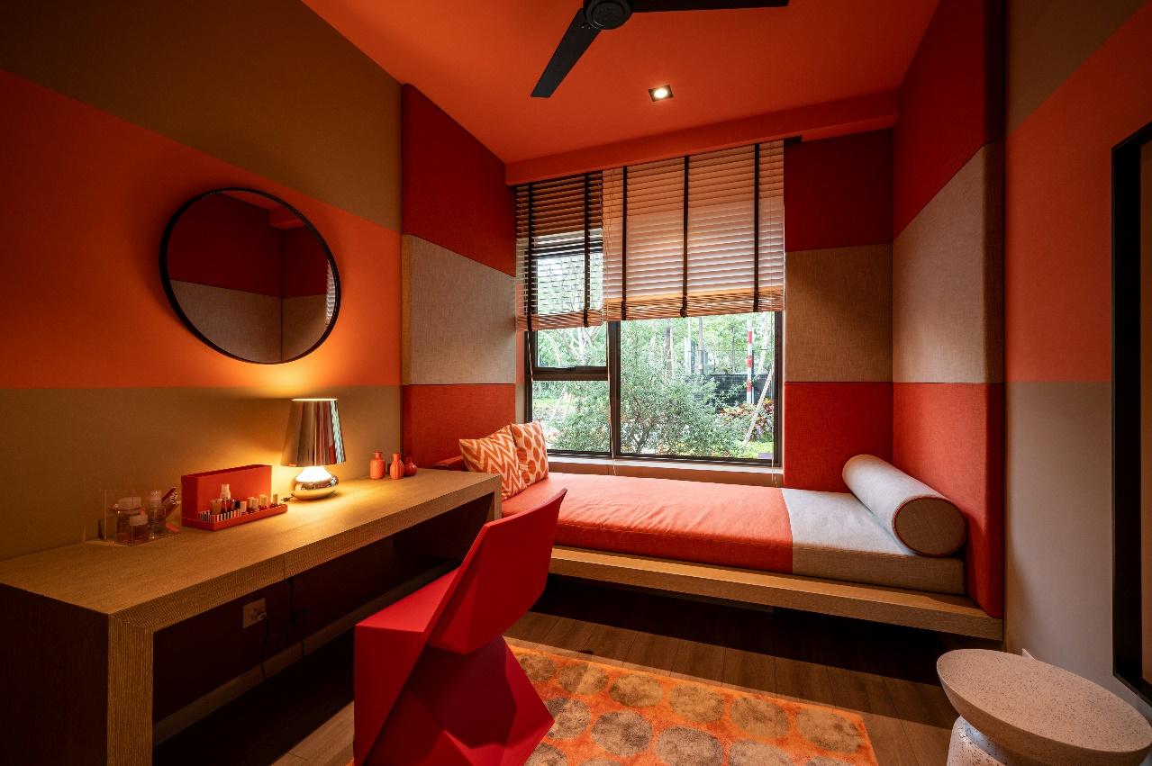
Use red where it earns its drama
A full red room is wonderfully cinematic, but it is not the only route. In fact, the most successful schemes often place red on an architectural element that deserves attention: a library alcove, the interior of a glazed cabinet, a ceiling, a stair runner or the wall behind a bed.
In a living room, a single red sofa can anchor a pale, textural space far more effectively than a scattering of small accessories. In a kitchen, red bar stools or a painted pantry door introduce personality without locking the whole room into one mood. Bathrooms are particularly suited to a braver gesture, whether that is a ruby vanity, mosaic tiles in a deep garnet tone, or a glossy red light fitting against creamy plaster.
Let light make the final decision
Red is notoriously changeable. A shade that feels elegant and earthy in morning daylight can turn heavy under a warm bulb after dark. This is the reason why it’s important to do a lot of tests and sample generously, so you can find a shade of red that works perfectly for your particular situation.
Paint a large card, move it around the room and look at it in daylight, lamplight and evening shadow. North-facing spaces can benefit from reds with orange or brown undertones, which counteract cool light. Bright south-facing rooms can carry clearer, darker or bluer reds without feeling oppressive. In a small room with limited light, consider a red that is softened with brown, plum or pink rather than a hard, high-chroma scarlet.
A glossy finish will amplify the energy and reflect light; a chalky matt finish makes red feel more architectural and calm. The same pigment can seem almost like two different colours depending on sheen.
Balance heat with texture and contrast
Red needs breathing room. The easiest way to give it is with materials that temper its intensity: pale oak, travertine, cream boucle, woven rush, aged brass and veined marble all create a relaxed counterpoint. Black can make red look sharper and more graphic, while dusty pink, tobacco, olive and inky blue offer a layered, grown-up palette.
Do not feel compelled to match every red element exactly. A rust velvet armchair beside a cherry-toned lamp and a wine-coloured artwork look much more compelling than a perfectly coordinated set. The variation creates depth, much like a well-dressed room should.
Artwork is another elegant entry point. A large canvas with a red ground or a small piece of red mosaic art can establish the colour story, then allow you to echo it lightly through a cushion, a book spine or a lampshade.
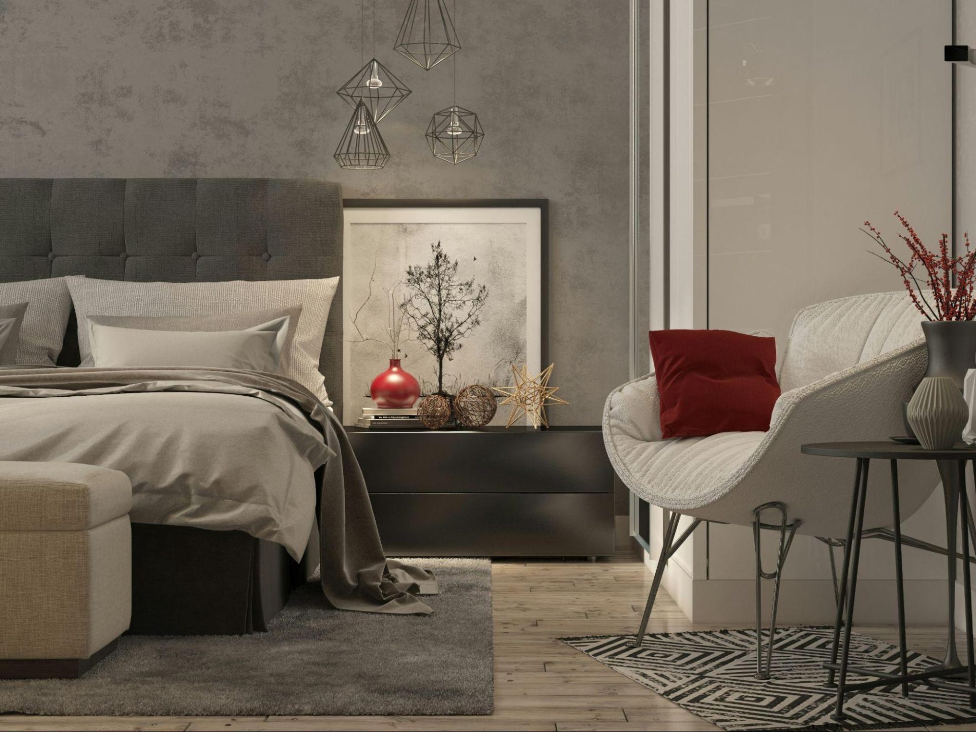
Keep the rest of the room carefully curated
The risk with red is not that it is too much; it is that everything around it competes for attention. Once red becomes the visual lead, simplify the supporting cast. Choose a limited family of finishes, repeat one or two metals, and leave some surfaces quiet.
This is especially useful in maximalist rooms. Red works beautifully with pattern, but it needs a visual hierarchy. Let the red wall be the backdrop and the patterned chair the supporting player, or reverse the equation. When both are shouting, the room can easily become overwhelming.
A colour with staying power
Red may be enjoying a fresh surge of attention, but it has always had a place in serious interiors: in lacquered dining rooms, Persian rugs, Venetian plaster, Georgian libraries and the humble red-check tablecloth. This may not be the color for everyone, but when done well, red interiors become some of the most memorable ones.
